Google Cloud

Cloudstyle
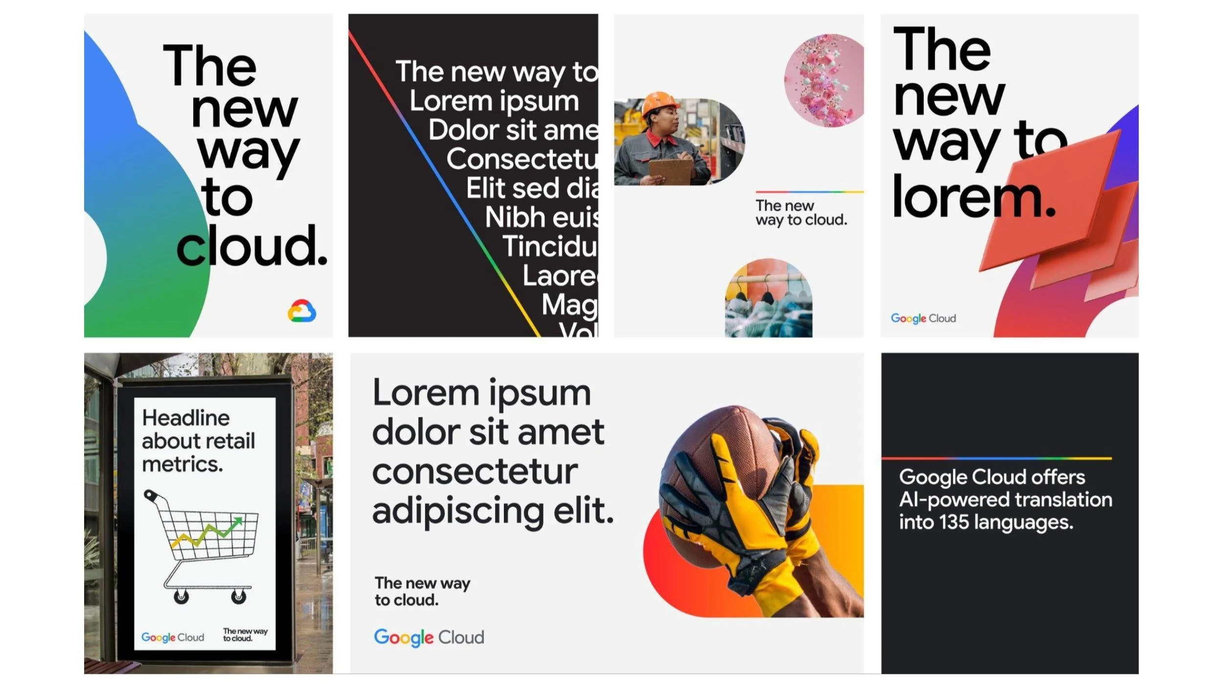
When I joined Google Cloud five years ago, the design guidelines were bare bones—clear space, typeface, and brand colors. It has been an honor to lead the effort to build a world-class, comprehensive design system, lovingly nicknamed 'Cloudstyle', from the ground up.

Progress is linear
There was a need for an easy-to-use identity element that conveyed Google brand impression quickly. The Progress Bar takes our brand icon and rolls it out into a straight line, keeping the same color proportions and order.


Gradients the Google way
Needing a way to visually communicate our AI offerings to our customers, we developed a gradient palette that stays true to who we are as a brand.


Consistency is a real pill
Brand shape language was pulled from the geometry of our icon and wordmark to give designers material to work with that is undeniably Google.


Editorializing our illustration
Illustration is a core part of the Google brand, but with Cloud’s B2B audience, we leveraged an editorial approach to come across as more intelligent and serious given the multi-million dollar nature of our deals.


Designed to scale
An unique aspect of the Cloud brand, is the need for the system to flex for a range of skill levels. We created extensive guidelines and templates to ensure that our brand is consistent no matter who is using it.