Häagen-Dazs

Häagen-Dazs
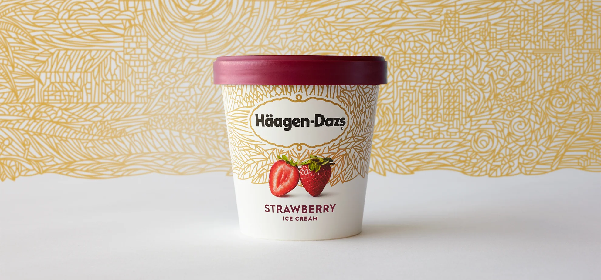
Häagen-Dazs is a beloved brand, but many consumers considered it their “mom’s ice cream.” Our goal was to modernize and elevate the packaging without losing their hard-won equity.

Meaningful heritage
One of HD’s oldest brand elements—the tapestry—had been underutilized almost to the point of retirement.

A Living Tapestry
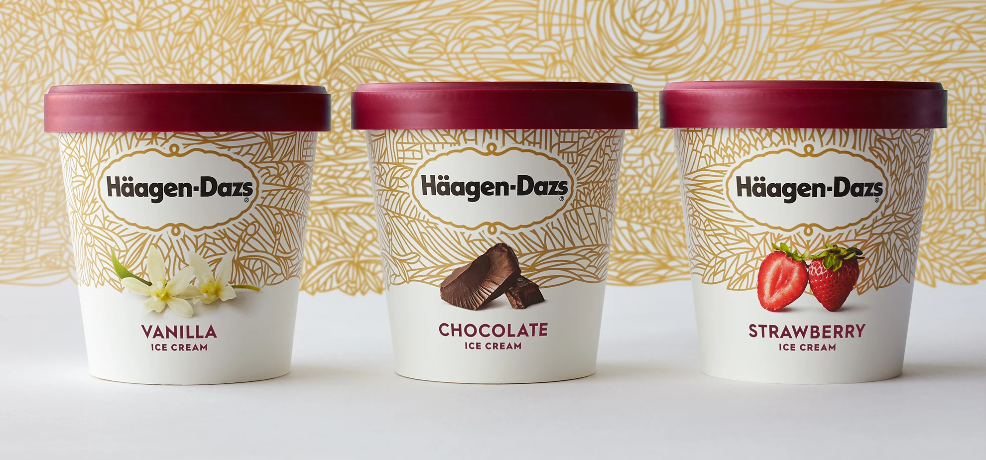
We reimagined the brand tapestry as an ornate illustration telling the brand’s story of “farm to spoon”. Hidden within are easter eggs like their first store, the hunt for the perfect strawberry, and even a nod to the founder’s wife, Rose.


More than meets the eye
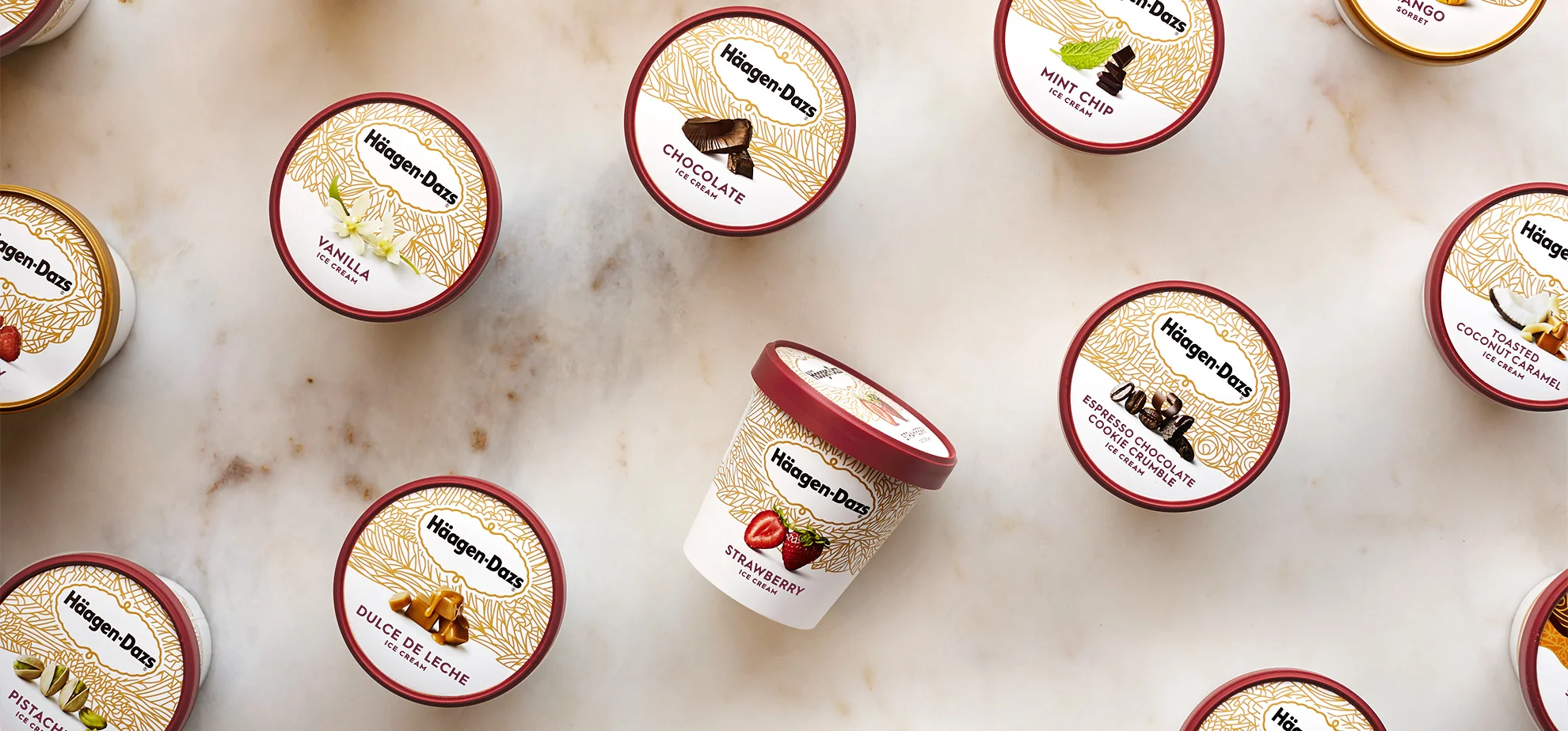
Each carton features a unique crop of the overall tapestry, so that all of the flavors combine to form the complete illustration.


